
Fragole Ristorante

A case study in web design: Fragole Ristorante - Brooklyn, NY
An Outdated Website Gets a Much Needed Rebrand
MY CONTRIBUTION
Research, Ideation, Branding, UI/UX, Photography, Visual Design, Content, User Testing, Web Development
DELIVERABLES
Final Site & All Content, Wireframes,
Hi-Fi Mockups, User Testing, Logo Development, Photography
TOOLS
Figma, Adobe Photoshop,
Squarespace
DURATION
1 Month for V1
WHAT IS FRAGOLE RISTORANTE?
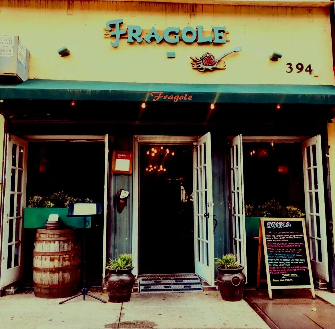
Fragole Ristorante (Fragole) is an Italian restaurant in Brooklyn, NY. It was established in 2003 with the current owners taking control in 2017. Fragole represents the true American dream: immigrants working their way up for over a decade from delivery men, to bus boys, to servers, to managers, to owners. For many years Fragole’s website had remained unchanged. When I proposed to the current owners that the website could be updated and improved with a sleeker, more modernized and user-friendly design, they expressed enthusiasm and full support for me to make these changes.
My contributions to this project were to conduct research, design the website, and test all UX/UI and web development. I also created/remade the majority of the content and assets for the website, including photos, logo design, and post-production. I collaborated with the owners to rebrand their website to align with their goals.
DISCOVERY
RESEARCH & INSIGHT INTO THE PROBLEM
My first step in conducting this project was to identify who we were building for and why they needed it.
Meetings with the owners painted the picture clearly. They had an existing, successful restaurant with a low functioning, difficult to navigate, and aesthetically unpleasing website. The physical interior of Fragole has a charming, rustic yet modern feel. One of the owners’ main goals was to have the new website thematically match the comforting glow of an evening in their space; flickering candles, exposed brick walls, and a gorgeous wooden bar. We chose a white, gold, and silver theme for their website to best mirror their vision; clean and warm.
Because ordering takeout/delivery from Fragole’s website earns them 15% more per order than orders placed through a delivery app, the owners and I agreed that it was vital to make the user journey for ordering from their website as clear as possible.
DEFINITION
SYNTHESIS OF RESEARCH & IDENTIFICATION OF FOCUS AREAS
I began my research by compiling a list of competitors, both direct and indirect, and examined their web practices. Using a moodboard that I created, I walked the Fragole team through current web trends and practices. Doing so enabled the owners to express their goal to have the website rebrand be elegant, modern, and minimalist. These values needed to be reflected from the moment someone landed on the homepage. Looking at the results of my research, I agreed that this rebrand strategy was the best route for them.
MOODBOARD
Using the moodboard that I created, I worked with my clients to help them narrow down the specific look, tone, and approach they wanted for their new website.

Low-fidelity Wireframes for Desktop
Simplify, simplify, simplify was the rebrand goal for the lo-fidelity wireframes. Everything clean, easy to see and access, and without an overabundance of images to overwhelm the user.


DESIGN
IDEATION AND BRAINSTORMING SOLUTIONS
I pooled all the content I found among competitors’ websites and used my findings to envision a clear, succinct, new website for Fragole. Additionally I developed the assets and imagery to capture the essence of Fragole in a digital space.
I drew sketches to give the clients an overview of my recommendations and we talked through each page of the agreed-upon site map. Heavy emphasis was placed a clear list of goals and changes for the rebrand. The website issues needing to be resolved included the following: too many pictures of food, an overly lengthy homepage, poorly functioning UI, unnecessary customer testimonials, extraneous details about the restaurant, difficult to find information about hours/location, outdated and misplaced menus, overuse of different fonts, clashing color schemes, typos, and low image resolution.
I designed and circulated a large survey to potential users with questions for the respondents pertaining to the above issues. Based on my synthesis of the survey results along with my research, the owners and I decided on the following:
1. A short and condensed homepage with a prominent hero image.
2. Elimination of customer testimonials.
3. Two short blurbs about Fragole, one on the home page and one in the “About” section.
4. Prevalent and prominent hours/location postings on each page.
5. A complete revamp of the menu style to incorporate the new logo and gold/white/silver theme.
6. A select number of colors for the website. White background with light gold, dark gold, silver, and black fonts only.
7. New hi-resolution images of food, with food images being placed on the menu page only.
8. A short but succinct “About” section detailing the backgrounds of the owners and head chef as they each have fascinating personal stories and long histories with Fragole and the neighborhood community.
DELIVERY
INCORPORATING THE SOLUTIONS AND BUILDING THE WEBSITE
Taking into account the needs of the clients, the needs of the users, the survey results and all research conducted, the final site was developed and is now live. Below, one can find the before and after images of key pages.
Homepage
Before


After


Menu
Before


After


Each menu section now links to a menu PDF, ex below:

Before
Specials


After


LOGO REDESIGN
The word “fragole” means strawberries in Italian. The old logo was problematic in that it only had one strawberry (whereas “fragole” is plural), the strawberry itself wasn’t necessarily recognizable as a strawberry for many users, and users were confused as to the spoon silhouette and its relevance to an Italian restaurant.
Old Logo


New Logo